My first experience working with pencil-and-paper animation, I think I had this class in my 2nd or 3rd quarter.
The first assignment consisted of the two most basic animation exercises, a pendulum and a bouncing ball. The pendulum focused on timing and had to loop smoothly, while the ball taught physics and had to bounce 3 times and settle to a stop.
Pendulum Animation
Bouncing Ball Animation
I think the next assignment this one, where we animated a character stretching. I remember animating most of this backwards for some reason.
Character Stretching Animation
Next was our first walking animation, we had to make a character take 3 steps. This one looks really "stompy" because I copied the example poses a bit too well.
Three Step Walk Animation
Then we had to make a walk cycle that held the character in place. I made a zombie character for fun, and tried to make him slump and flop all over. It kind of worked...
Zombie Walk Cycle
The next assignment was more complex, we had to animate a flour sack climbing up a slide, then sliding down it. We had to use a second layer of paper for the background, I outlined mine in pen to make it stand out more.
Floursack Slide Animation
There was a final project, which was basically 5 second animation of whatever we wanted, but unfortunately my idea was a bit too ambitious for me at the time and I never completely finished. What little I have of it was really rushed and just looks crappy. It was a decent idea, though - basically an alligator cowboy walks into a bar, tries to get a drink, but it gets shot out of his hand, so he gets mad and pulls out his gun.
Labels
fan art
(18)
sketches
(18)
digital art
(14)
doodles
(8)
3d animation
(7)
rants
(6)
character design
(3)
2d animation
(2)
game reviews
(2)
concept art
(1)
Sunday, October 24, 2010
Wednesday, August 18, 2010
Work from Background Design, April/May/June 2010
Though I'm planning on going into Animation as a career, I still try to take as many fine art-like classes I can to improve my creativity and artistic skill. I also wanted to become a Concept Artist when I first came to AI of San Diego, but quickly learned that its a very competitive career and only the very best make it that far.
I looked forward to this class to learn techniques for digital painting with Photoshop, and to learn composition and designing backgrounds/environments.
The overall theme was the story of the Odyssey.
The first painting was in all grayscale to help us learn values and such.
I designed an underwater shack as the home of Poseidon.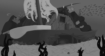
Next we were introduced to color. It's a bit easier digitally since you can just paint it in grayscale and colorize it.
I chose a more vertical page ratio, and designed Mount Olympus, home of the gods: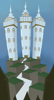 At first they were going to be more Skyscraper-like, but the teacher insisted on keeping every environment within the same world in terms of style. So I took reference from 1800s style buildings.
For the final painting we were shown how to incorporate photo textures to enhance the painting and reduce the painting work you have to do. You have to tweak it A LOT to make it work though, or else it looks....photoshopped. :P
I tried an indoor environment this time, with our heroes sneaking through the home of the Cyclops seeking an escape:
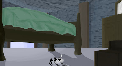 The teacher showed me a way to darken the whole scene drastically, but I don't have the jpg of that version. I'd rather redo this painting, honestly.
Of the the three, I liked my first painting the most. Still, it was a great class.
I looked forward to this class to learn techniques for digital painting with Photoshop, and to learn composition and designing backgrounds/environments.
The overall theme was the story of the Odyssey.
The first painting was in all grayscale to help us learn values and such.
I designed an underwater shack as the home of Poseidon.

Next we were introduced to color. It's a bit easier digitally since you can just paint it in grayscale and colorize it.
I chose a more vertical page ratio, and designed Mount Olympus, home of the gods:
 At first they were going to be more Skyscraper-like, but the teacher insisted on keeping every environment within the same world in terms of style. So I took reference from 1800s style buildings.
For the final painting we were shown how to incorporate photo textures to enhance the painting and reduce the painting work you have to do. You have to tweak it A LOT to make it work though, or else it looks....photoshopped. :P
I tried an indoor environment this time, with our heroes sneaking through the home of the Cyclops seeking an escape:
 The teacher showed me a way to darken the whole scene drastically, but I don't have the jpg of that version. I'd rather redo this painting, honestly.
Of the the three, I liked my first painting the most. Still, it was a great class.
Wednesday, July 7, 2010
Father's Day Picture
I know Father's Day was a while ago, but I thought I'd share this.
We couldn't afford to buy a card for my Dad (yes, we're that poor), so my Mom asked me to make a card on my computer.
So, I whipped up a quick Father's Day card template in Microsoft Publisher 2007 and drew a cute picture in Adobe Flash with my tablet and mad drawing skills =)
I started with the idea of a big reptilian creature with its offspring standing on its head, and after a bit of sketching came up with a couple of T-Rexes.
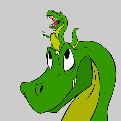
My Dad liked it so much that he emailed it to his family and made it his desktop background for a while. =)
We couldn't afford to buy a card for my Dad (yes, we're that poor), so my Mom asked me to make a card on my computer.
So, I whipped up a quick Father's Day card template in Microsoft Publisher 2007 and drew a cute picture in Adobe Flash with my tablet and mad drawing skills =)
I started with the idea of a big reptilian creature with its offspring standing on its head, and after a bit of sketching came up with a couple of T-Rexes.

My Dad liked it so much that he emailed it to his family and made it his desktop background for a while. =)
Subscribe to:
Comments (Atom)